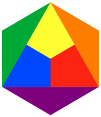

The RYB Color Model: A Journey Through Art History
Colour has always shaped how we see and understand the world. Among the many colour systems artists use, none carries more history than RYB — Red, Yellow, and Blue. These three hues form the backbone of traditional painting, art education, and visual storytelling. Long before screens and inkjet printers, painters needed a practical system to mix pigments. RYB became that system — and it never stopped being one.
RYB
Two Sets of Primary Colours
Here is a fact that surprises many people: there are two different sets of primary colours, and they serve two different purposes.
- RYB (Red, Yellow, Blue) is the traditional artists’ set of primaries. It is what generations of painters were taught, what most art classrooms still use, and the basis of the classic colour wheel.
- CMY (Cyan, Magenta, Yellow) is the modern colour-science set. It is what professional printing, photographic processes, and colour theory after the 19th century actually rely on, because cyan and magenta mix pigments more accurately than blue and red do.
In strict scientific terms, CMY is the more “correct” subtractive primary set. Mixing cyan and magenta produces cleaner, more predictable secondary colours than mixing standard red and blue paint ever can. This is why your home printer uses cyan and magenta ink cartridges, not red ones.
So why does RYB still matter? Because art history did not wait for colour science. Painters, art schools, and colour theorists had already built centuries of practice, language, and symbolism around red, yellow, and blue before CMY was understood. RYB is not the most accurate primary system — but it is the most historic one, the one with a story, a tradition, and a cultural identity that CMY, for all its precision, has never had.
Key distinction: CMY is the primary set that colour science prefers. RYB is the primary set that art history remembers.
Origins of the RYB Color Model
The RYB model — sometimes called the artistic colour wheel — is a subtractive system, meaning colours are created by mixing pigments that absorb, rather than emit, light.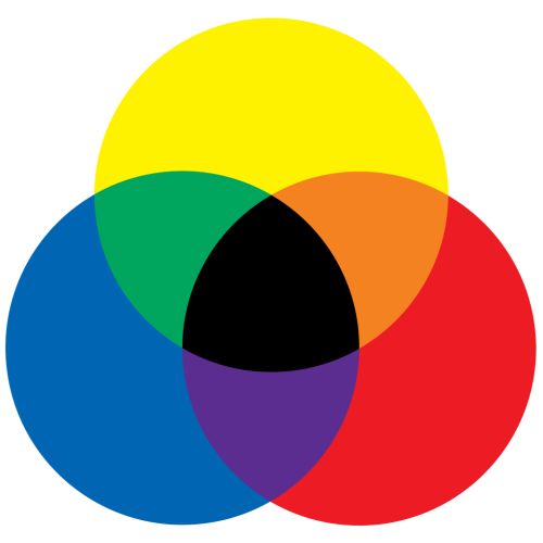
RYB Color Model
In this model:
- Red, yellow, and blue are the primary colours.
- Mixing two primaries creates secondary colours — orange, green, and purple.
- Mixing a primary with a neighbouring secondary creates tertiary colours, such as red-orange or blue-green.
Generations of artists have used this system to build harmony and contrast in their work, often visualised as a circle showing how one colour flows into the next.
Historical Development: From Renaissance to Enlightenment
The idea of organising colour is centuries old. During the Renaissance, thinkers such as Leonardo da Vinci explored how colours relate to one another, long before any formal theory existed. It was Isaac Newton’s prism experiments in the 17th century that began the scientific study of light and colour — showing how white light splits into a spectrum, and influencing both artists and scientists who followed.
In the 18th century, the French author Claude Boutet produced some of the earliest visual colour wheels built on red, yellow, and blue. His 1708 treatise on miniature painting included seven- and twelve-colour circles that closely resemble what art students are still taught today.
A century later, the German writer Johann Wolfgang von Goethe published his Theory of Colours (1810). Goethe was less interested in physics than in the emotional and perceptual effects of colour — and his ideas left a deep mark on how artists, rather than scientists, thought about red, yellow, and blue.

Boutet’s 7-color and 12-color color circles from 1708
Source: The Creation of Color in Eighteenth-Century Europe – gutenberg-e.org/lowengard
Is RYB “The Colour of the Art World”?
It is tempting to say red, yellow, and blue are the colours of the art world. They appear in flags, civic seals, and institutional branding — even the historic logo of the U.S. National Endowment for the Arts was built from three coloured triangles. But this claim deserves a more careful look.
Flags and seals favour red, yellow, and blue mostly for practical and heraldic reasons: these are pigments that have long been stable, visible, and available, and they sit among the handful of standard tinctures used in heraldry. That is a different story from an art-historical one, and it is worth not conflating the two.
What is true, and well documented, is narrower and arguably more interesting: red, yellow, and blue hold a uniquely foundational place in art theory and pedagogy. They are the colours art students are still taught cannot be mixed from others, and from which — in traditional instruction — all other colours are said to derive. Most of art history was not built around RYB as a symbolic set. Colour symbolism varies enormously across periods and cultures — gold and ultramarine in religious painting, ochre and earth tones in many indigenous traditions, black, white, and red in early modernist abstraction. RYB’s special status is real, but it belongs to one specific lineage: the European tradition of primary-colour theory, running from Boutet through Goethe to its most famous 20th-century expression.
RYB’s Place in This Picture: We do not claim red, yellow, and blue are universally “the” colours of art. We do claim something more specific and better supported: that these three colours carry a documented, centuries-long identity as the artists’ primaries — and that this identity, more than any other, is what De Stijl turned into a statement about universal human harmony. That is the lineage RYB draws on.
The Influence of De Stijl
In 1917, Dutch artist Theo van Doesburg founded a magazine called De Stijl (The Style). It became the voice of a new artistic philosophy. Van Doesburg and fellow artists, including Piet Mondriaan, Gerrit Rietveld, and Bart van der Leck, believed in reducing art to its purest elements: primary colours and geometric shapes.
Mondriaan, in particular, became the face of the movement. His grids of red, yellow, and blue set against white and black are instantly recognisable a century later. De Stijl was never only about painting — it reached into architecture, furniture, fashion, and urban design, aiming to transform society through a minimalist, universal visual language.
Read more in History of Primary Colours: Red, Yellow, and Blue in Art and De Stijl.
Cultural Symbolism of RYB Colours
Beyond their technical role, red, yellow, and blue carry emotional and cultural associations that artists, designers, and advertisers have long used with intention:
- Red: passion, danger, power
- Yellow: optimism, energy, warmth
- Blue: calm, trust, peace
These associations are not fixed or universal — they shift across cultures and eras — but their consistent use in art, branding, and activism is part of why the RYB triad still resonates today.
Modern Use and Limitations
Contemporary digital design has moved on from RYB in practice. Screens use RGB (red, green, blue, an additive system based on light), and professional printing uses CMYK (cyan, magenta, yellow, black). Both reproduce a far wider range of colour than RYB ever could, and both reflect actual colour science rather than artistic convention.
Yet RYB remains essential in art education. It teaches new artists how colours relate, both physically and emotionally, and it builds an intuitive understanding of harmony, contrast, and composition that no amount of technical colour science fully replaces.
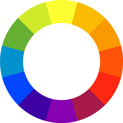
Color wheel
RYB Color Model Parallel: The SDG Color Wheel
In global development, another colour wheel has become widely recognised: the Sustainable Development Goals (SDG) colour wheel, adopted by the United Nations in 2015. It assigns one of 17 distinct colours to each goal, from no poverty to gender equality to climate action.
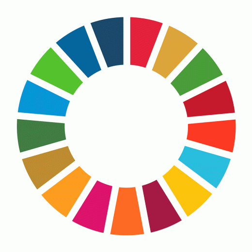
SDG color wheel
Like the RYB wheel, the SDG wheel uses colour to organise complex ideas into a single visual language. Its circular form echoes the same ambition De Stijl once had: that colour and geometry, used deliberately, can represent unity and interdependence at a global scale.
Why RYB Chose These Colours
This history is not background trivia for us — it is the reason behind our name.
RYB Global Development takes its name directly from this lineage: the artists’ primary colours, with their centuries of pedagogy and symbolism, culminating in De Stijl’s attempt to turn three pigments into a universal language of harmony. We use the same three colours across our platforms and our branding as a deliberate echo of that ambition.
Where De Stijl used red, yellow, and blue to argue that art could be reduced to a universal visual grammar, we use them to trace a different story: the Red Yellow Blue Silk Road, our research project and touring exhibition tracing how civilisations across history have independently reached for the same three colours to record their own culture and history. It’s the same spirit of universality that Mondriaan and his contemporaries once painted onto canvas — applied to a much older and wider story.
Looking Forward
The RYB colour model may be centuries old, but it continues to shape how we see and create. From Boutet’s colour circles to Mondriaan’s canvases, from classroom colour wheels to the research we are building today, red, yellow, and blue have proven their resilience.
Colour is more than pigment. It is language, emotion, and — for RYB — the thread running through the Red Yellow Blue Silk Road, our project connecting people across the world around a shared history of culture and peace.